Interested in a special purchase for yourself? My representational oil paintings are for sale on UGallery here!
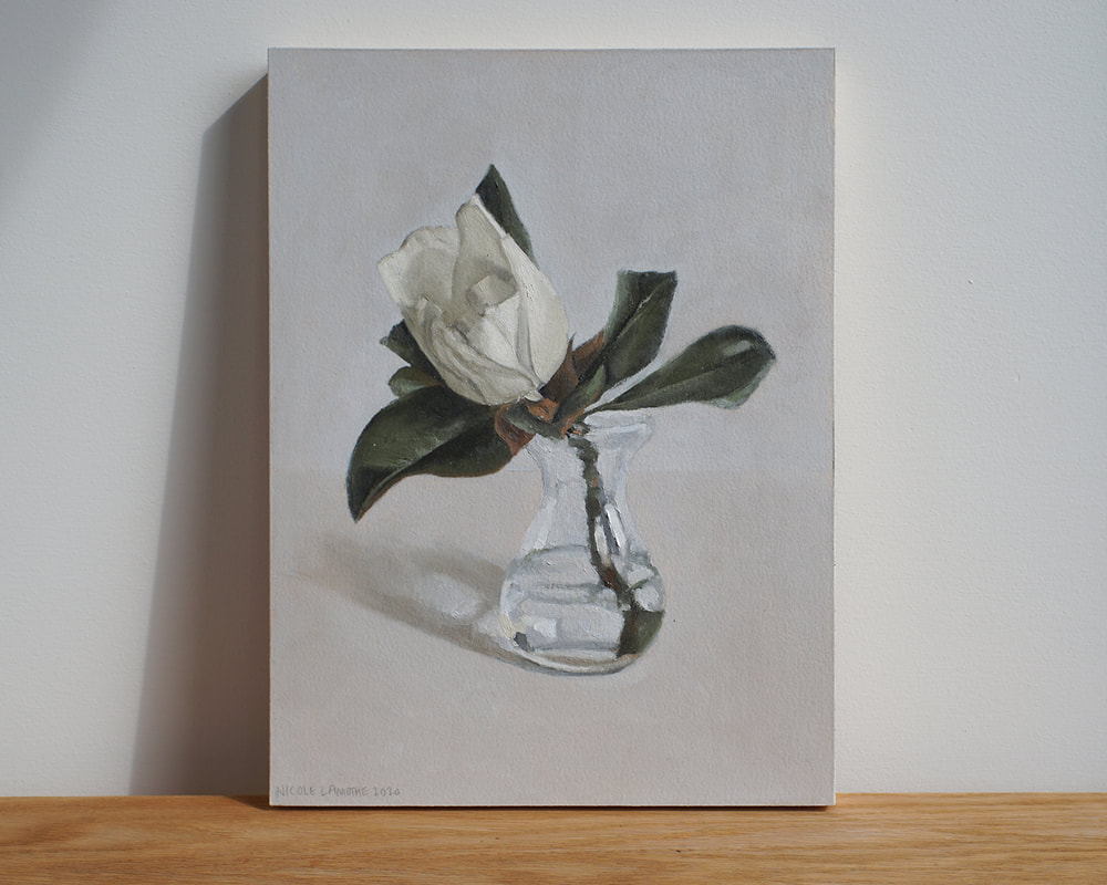
In the midst of packaging and sending a brand new painting across the country. Well wishes for a safe journey to a new home. I enjoyed having this Magnolia painting on my wall, even though it was just for a short time. I hope it brings as much joy to its new owner that it did for me. Interested in a special purchase for yourself? My representational oil paintings are for sale on UGallery here!
0 Comments
I am excited to announce my artworks featured in curated collection on UGallery. Click the button above to check out my eternal flowers collection of blooming Lilies for purchase on UGallery. I loved the way these yellow roses appeared just before reaching their fullest glory in bloom. They have a vibrant, young quality about them and the golden, warm light of sunset illuminating this bouquet was beautiful. The yellows were intensified by the warm light, but remained subtle. The light helped to shift the shadows towards warmth. Working from direct observation, I needed to capture my vision for this painting rapidly. I created the drawing for this painting in a single session. The painting was created in two sessions and the method of painting leans towards alla prima. Alla prima is a method of painting using a wet-on-wet technique, where the paint application is direct and brushwork more painterly. Works are generally started and finished in a single session.
The Golden Hour is currently for sale on UGallery.com. Click here to view. When I think of cool colors I see blue, green, and violet: water, the ocean and things that are cool to the touch.Thinking of warmth, I see reds, oranges and yellows: fire, things that are warm to the touch. I would guess this association is common among most humans.
Identifying warm and cool colors and seeing the difference between this distinction is not always evident when choosing and mixing colors for painting. Artists are faced with an array of tube colors, in warm and cool varieties that circle the spectrum. Adding to this choice, we must identify the light’s temperature that illuminates our subject, and hone in on the subtleties presented. Think about an object and it’s color at dawn, midday or dusk, or the light in a candle-lit room, or even the night lit by moonlight. In every situation, the temperature of the light (warm or cool) affects the color of the object in view. As if identifying the temperature of light seems complicated, artists need to take into consideration the local color of the object/subject in question. Local color is the color we perceive the subjects to be: a yellow banana, a red apple, a blue sky, and so on. Choosing colors for a painting is like a math equation, using color instead of numbers. We interpret the local color, add the temperature of light, mix the two together for a pleasing outcome. This process is repeated for each light, mid-tone and dark of any given subject. Summed up, the final color presented is the artist’s interpretation in response to what’s placed before their eyes in a complicated mix to achieve believability. |
Nicole LamotheForever learning... working towards mastery, sharing my artistic growth, knowledge and insights. Archives
September 2023
Categories |